
As you know, Coronavirus is a pandemic disease. It is spreading in almost every country, and people are locked down in their houses. In the article, Visualize Coronavirus impact using a Power BI Dashboard, we visualized the impact of Coronavirus using Power BI Desktop.
In this article, we will explore a few other ways to represent data in Power BI and focus on the trend of coronavirus cases in India. We will also look at how social distancing can help in reducing the cases.
Import data for Power BI Report
In this article, we will use reference data from the Wikipedia page 2020 coronavirus pandemic in India.
Launch Power BI Desktop and import data from a web data source using Get Data -> Web.
It shows you a list of tables from the pages. Select the highlighted table and click on Transform Data.

Before we prepare a visual, we need the following changes in the data set.
- Click on Use first row as a header to use table column headers, as shown below:
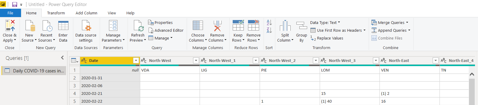
- We do not require regional data in the data set. Select the unwanted columns and remove these. We can also remove the new cases columns data from the imported data set:
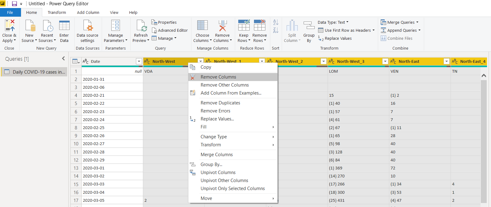
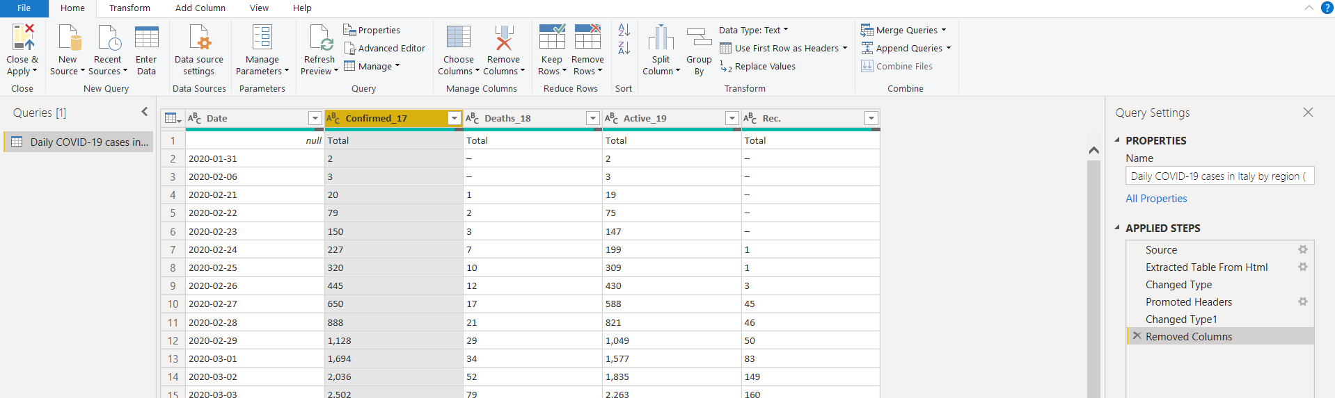
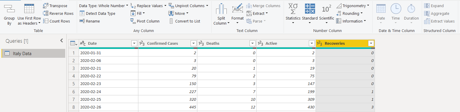
We have the following columns available after removing unwanted columns. You can also follow the applied steps shown in the below image.
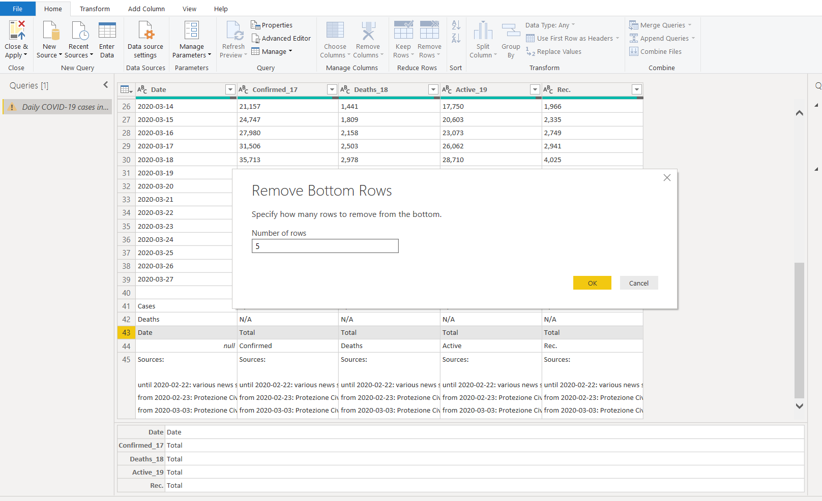
- As we import data from a web data source, it might show you data that is not required for the report:
o Remove the bottom 5 rows from this data set
o Remove Top 1 row. It contains NULL values and headers that are not required for visuals in this article
Click on Transform and change the data type to Date from a drop-down list.
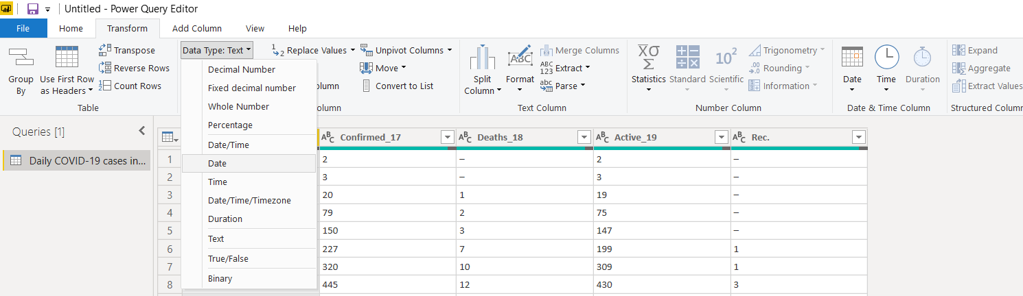
Similarly, change the data type for other columns as the Whole Number. In a few columns (Confirmed, Deaths and Active), once we change the data type to the whole number, it shows error for few rows data.
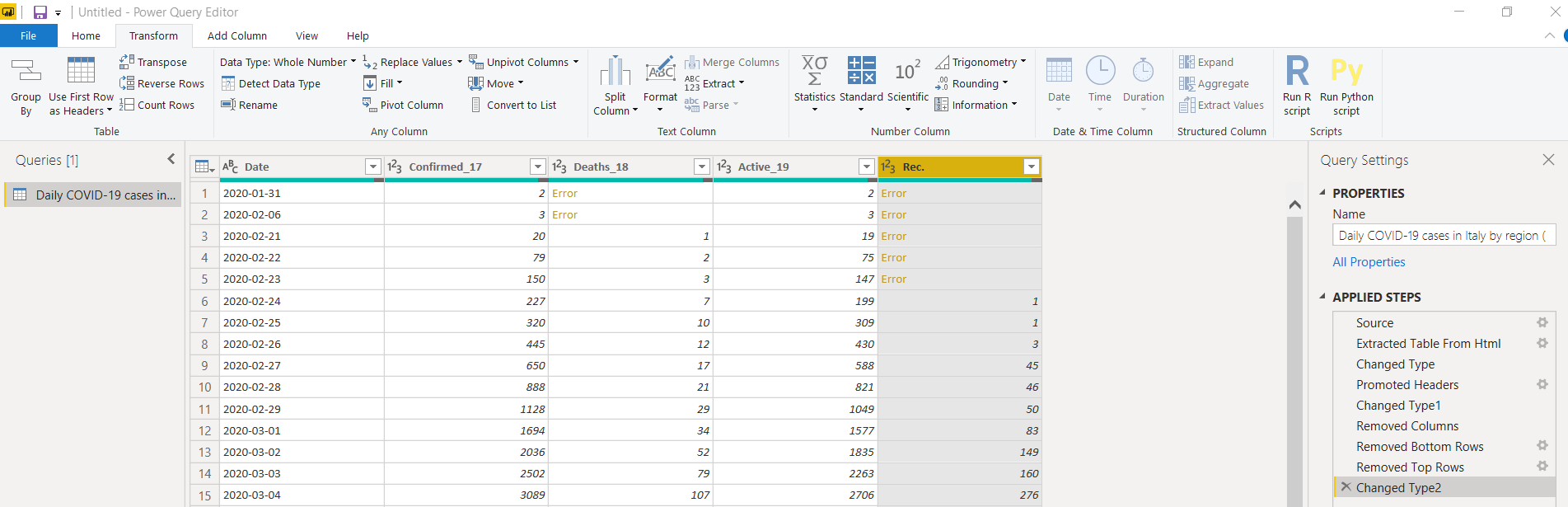
To resolve this, change the data type back to the text and replace the values for the dash (-) with zero.
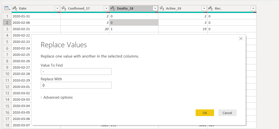
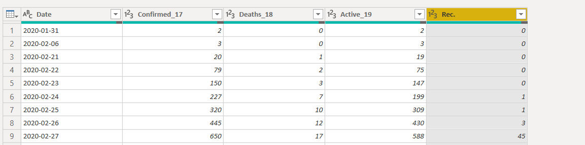
Now, switch to the whole number data type again, and it works fine.
Rename the columns’ names to give a preferred naming convention
Save the changes
(Close & Apply), and we get the data set in Power BI as shown below.

Create an Area Chart visualization in Power BI Desktop
Let’s start creating the visualizations for this article. We want the following area chart for this visual. It is available in the default visualizations.

Use the following steps to prepare this visual.
- Drag the required field from the data set in the columns area:
o Axis: Date
o Values: Deaths, Recoveries and Confirmed cases

- Turn on the high-density sampling from the format area:

- Enable the data labels property. It shows the data labels ( values) on the chart area. Here, we choose display units as None to show actual values in the chart. We can use display units to shows values in thousands, Millions, Billions:

- Enable Show Marker. It shows data points in the chart. We can also change the marker shape if required:

- Title alignment: Set the tile alignment to left, center or right. Here, we select the center alignment. By default, it shows a title depending upon the selected data fields. You can also modify the default title as per your requirement:

- Click on the image and import an image in the report. Adjust the image size and move it in the blank area of the chart:
It completes the configuration of the visual we showed earlier.
We can take the mouse pointer over any data point, and it gives you complete information.
- Date
- Total confirmed cases, recoveries and deaths
Visualize Coronavirus impact on the age groups in India
Now, we will analyse the confirmed cases in India by their age group. For this, we will use the same URL and import the following data table. We do not need to close the report. You can click on the get data in the ribbon bar and use Get Data -> web for it.
Here, you can transform data, as shown earlier. After transformation, my data looks like below.

Once we save the transformations, it shows an additional data set in the Power BI Report fields section, as shown below.
Once we have transformed data, drag the Ribbon chart and adjust the size of it in the Power BI Desktop report. In the chart configuration, drag the columns, as shown in the following image. We have not done any formatting in this chart; however, you can go in the format area and do the various configuration such as data colour, title, axis, border.
- Axis: Classification
- Value: Cases, Deaths
Add the PIE chart in the Power BI Report
We can use the PIE chart in Power BI to compare the categories among each other. For example, we want to know the percentage of cases and deaths in each age group. Let’s add a PIE chart from the visualizations and configure them for total cases and deaths, as shown below.

Conclusion
In this article, we explored different ways of visualizing coronavirus impact in India on a daily basis. It also shows the coronavirus impact on different age groups. In the end, I hope you all doing good and taking all the necessary precautions and safety measures.
ReplyDeleteThanks for helping us understand this topic. you have written it in a way that makes it
very simple to understand. Thanks you so much.
click here
Thanks for sharing this blog this content is very significant for me I really appreciate you.
ReplyDeleteThe blogs you have posted have taught you a lot of good things Thanks for pasting.
click here now