Showing posts with label TABLEAU. Show all posts

Monday, March 11, 2013

[TABLEAU] Disaggregating And Aggregating Data


Disaggregating and Aggregating Data


Tableau makes it easy to aggregate and disaggregate data for specific fields or globally across all measures in the view. The aggregations available depend on the type of data source you are using. For example, if you are connected to Excel, Access, and text files you do not have access to the Count Distinct aggregation.


The view below shows several customers and the total amount of money they have spent at the superstore. The customers are sorted in order of total sales with the highest sales first. As you can see, the Sales Total measure is aggregated as a SUM.
You can change the aggregation using the field menu. Right-click the Sales measure on the Rows shelf and select
Measure > Average.


Now the view shows the average amount each customer has spent at the superstore.


When you look at the aggregated data in the views above, each bar represents all transactions for a specific customer summed up or averaged into a single value. Now say that you want to see the individual transactions for each customer. You can create a view like that by selecting Analysis > Aggregate Measures.
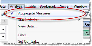


The menu item is then deselected and the Sales Total measure is disaggregated. The view now shows a mark for every row in the data source.


You can see that all of the customers have had multiple transactions some of them nearing $30,000. You can add another dimension by dragging the Product Category 1 field from the schema to the Color shelf. The view below shows the product distribution by customer. You can now see that in general, customers tend to spend more on technology than they do on office products and furniture.


Note: The Aggregate Measures command on the Analysis menu controls the aggregation for all measure in the view. You can also disaggregate measures individually using the field menu. Right-click the measure you want to disaggregate and select Dimension.


[TABLEAU] Annotations


Annotations


Use annotations to call attention to specific points, marks, and areas of the view, and to add information that makes the view more understandable. Annotations can be resized, repositioned, and formatted.


Add an Annotation

Right-click a mark, point, or area that you want to annotate. On the context menu, select Annotate, and then select the type of annotation you want to add.


In the Edit Annotation dialog box, type and format the annotation text, and then click OK.


The annotation appears in the view.


Resize and Reposition the Annotation

 Click and drag the annotation to a new location.


Use the resize handles to resize both the annotation and the arrow line.


 Format the Annotation

 To format the annotation box or arrow line,  right-click it and select Format. The Format window opens.


To reformat the text of the annotation, double-click it. The Edit Annotation dialog box opens.


[TABLEAU] Measure Names And Measure Values Explained

Measure Names and Measure Values Explained


What are the Measure Names and Measure Values fields?


When you connect to a data source Tableau automatically creates a field that contains all of the measure names and measure values. For example, below is a simple data source that contains three measures. From this data source, Tableau would create the Measure Names and Measure values fields shown on the right.


Why would you use these fields?


A common use of the Measure Names and Measure Values fields is to create a details table that shows all of the measure values for some categories. For example, the text table below shows financial measures for each product type. When you use the Measure Names and Measure Values fields, the Measure Values card automatically opens. You can use this card to quickly add and remove measures from the view.


Drag measures to or from the Measure Values card to add them to or remove them from the view.


Another common use for these fields is when you want to blend measures on a single axis. For example, let's say you were looking at a line chart showing sales over time. But then you ask, "How are the actual sales compared to the Budget?" When you drag the Budget Sales measure to the Columns shelf, you add another axis.


What you really want to do is add another line to the same chart. That's where the Measure Names and Measure Values fields come in handy. Instead of dragging the Budget Sales measure to the Columns shelf, drag it to the existing Sales axis in the view. You'll see an icon showing two axes side by side to let you know that you are about to blend two measures into a single axis.


When you blend two measures the Measure Values field automatically replaces the measure on the Columns shelf and the Measure Names field is placed on the Color shelf. Now the view has two lines --one for the actual Sales (orange) and one for the Budget Sales (blue). We can see sales has exceeded expectations in both years.


Measure Names and Measure Values fields can be used for so much more than just blending measures and text tables. For example, you can use Measure Names on the text shelf to label and annotate marks or create a quick filter on Measure Names to quickly show and hide data in the view. Now that you've seen an example of how to use the Measure Names and Measure Values fields, start experimenting and see how these fields can help you answer questions of your own data.


[TABLEAU] Color Legend Highlighting

Color Legend Highlighting


Color legend highlighting is a powerful analytical mode for the color legend that allows you to focus on selected members of the view. When you turn on color legend highlighting, the marks associated with the selected items in the color legend are colored, while all other marks are gray.


Step 1

To turn on color legend highlighting, click the Highlight button in the color legend title bar, or select Highlight Selected Items on the color legend menu.


 Step 2

Select members in the color legend that you want to highlight.


Step 3

To turn off color legend highlighting, click the Highlight button in the color legend title bar again, or clear the selection of Highlight Selected Items in the color legend menu. The colors in the view return to normal.


Step 4

If you like the way a view is highlighted, you can save the highlighting by assigning the highlight colors to the color palette. With the view highlighted the way you like it, select Assign Highlight Colors to Palette in the color legend menu (if this command is unavailable, this color scheme is already saved as a palette. You can verify this by selecting Edit Colors from the color legend menu.)